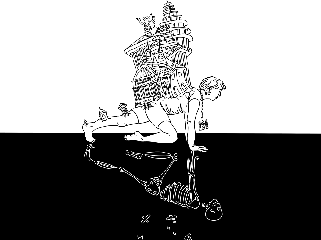
Background:
The Frye Art Museum is Seattle's only free art museum, founded with a gift of over 200 late nineteenth-century paintings to the people of Seattle. That gift stipulated that a portion of that founding collection must always be on view. This requirement limits The Frye's ability to show its expanding collection, and returning visitors might lose interest in artwork they have seen many times.
Project Category: UI/UX, Augmented Reality
Timeframe: 9 weeks
Collaborators: Solo project
Roles: UI/UX Designer, Animator, Videographer
Tools: Figma, Adobe Aero, Adobe After Effects
How might we provide a deeper understanding and engagement with the artwork without cluttering the small space of the museum?
Research

A survey of potential users found a slight majority would prefer using an app on their own phone rather than checking out an iPad from the museum. Additionally, through testing the prototype, it was found that holding an iPad up to see the content quickly becomes too heavy and cumbersome.
The survey results found, and broader research corroborated this finding, that people see AR as an exciting new experience that can bring additional value to a museum visit, but that they are concerned about “not being in the moment” and about technical difficulties.
To address these concerns, the UI was kept as simple and intuitive as possible and each interaction was short so as not to distract from the museum experience itself.

Data from The Audience Agency

Main Features:
The key tasks were addressing the emotional and functional needs of the users:
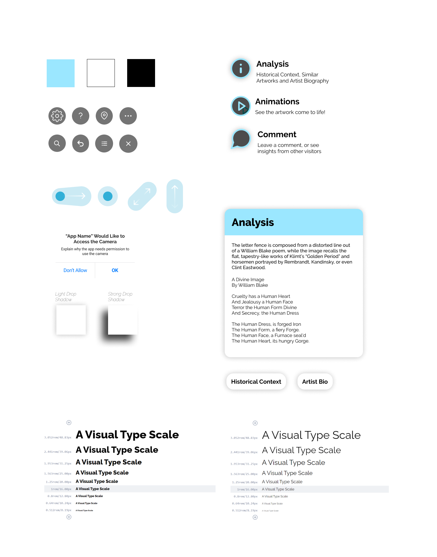
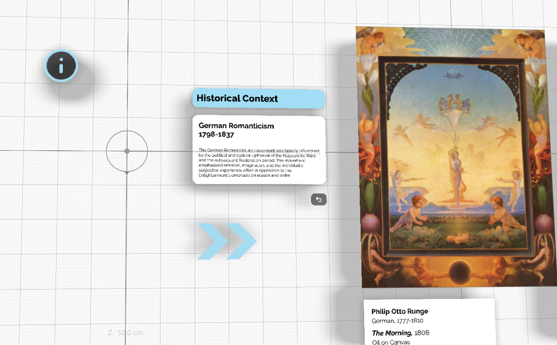
Analysis feature: Meets the functional need for education, and includes an artist biography, a brief historical context, a few key pieces from influencing art movements, and assistance in interpreting symbolic elements.
Animation feature: Meets the emotional need for entertainment Animations and 3D elements bring new life and interaction to the artwork.
Comment feature: Meets the emotional need for social connection through prompts, visitors share insights with other visitors.
Using the App
Welcome Screen at Museum Entrance
As visitors enter the museum they are greeted with a screen with animations to draw the eye and display the value of the app, and a CTA to download the app now.
Opening the App
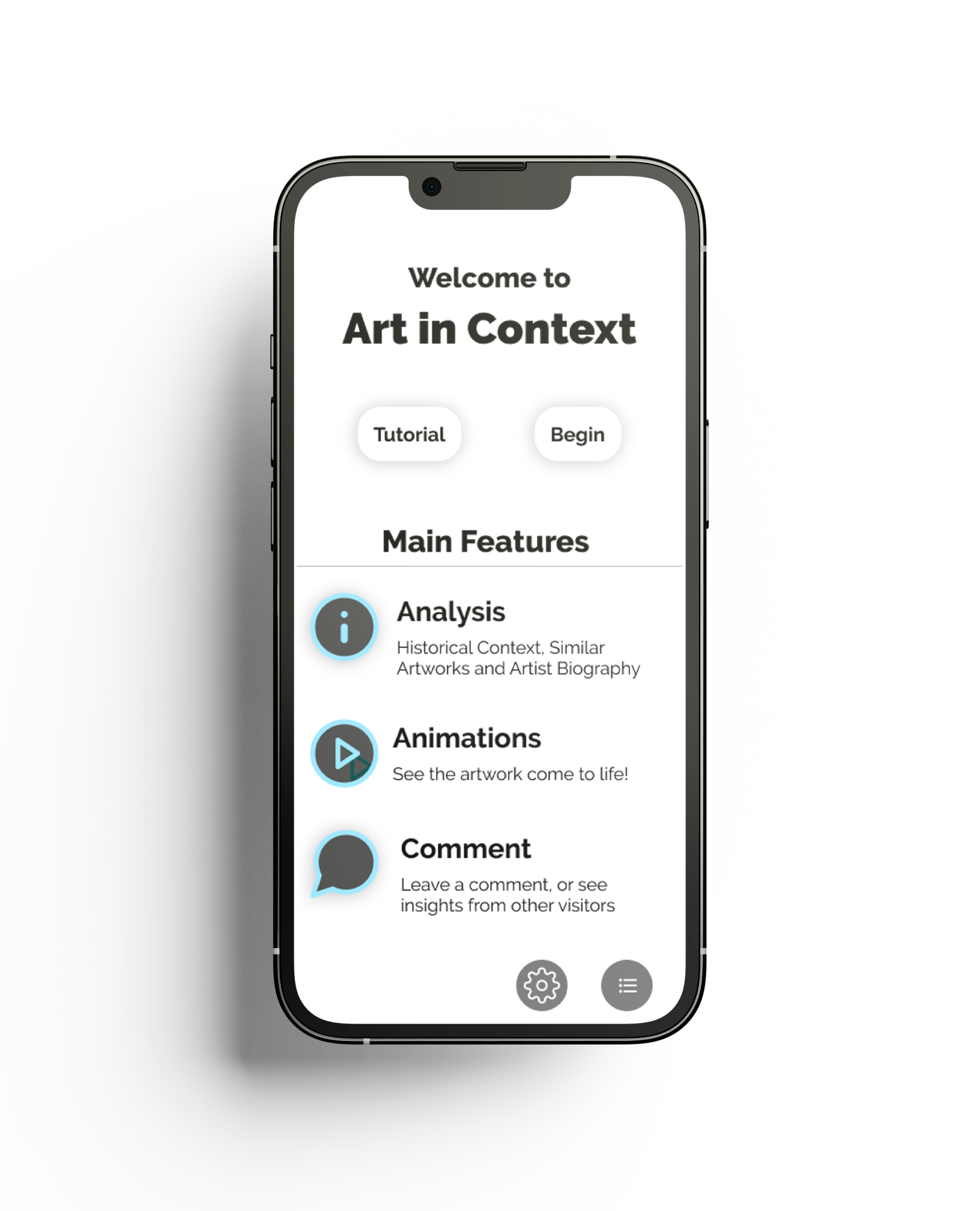
Welcome Screen: Users see a brief description of the main features, and can opt to go through a tutorial or get started.

Upon downloading and opening the app, a welcome screen opens that explains the main features of the app and offers a tutorial to help instruct them on how to use it.
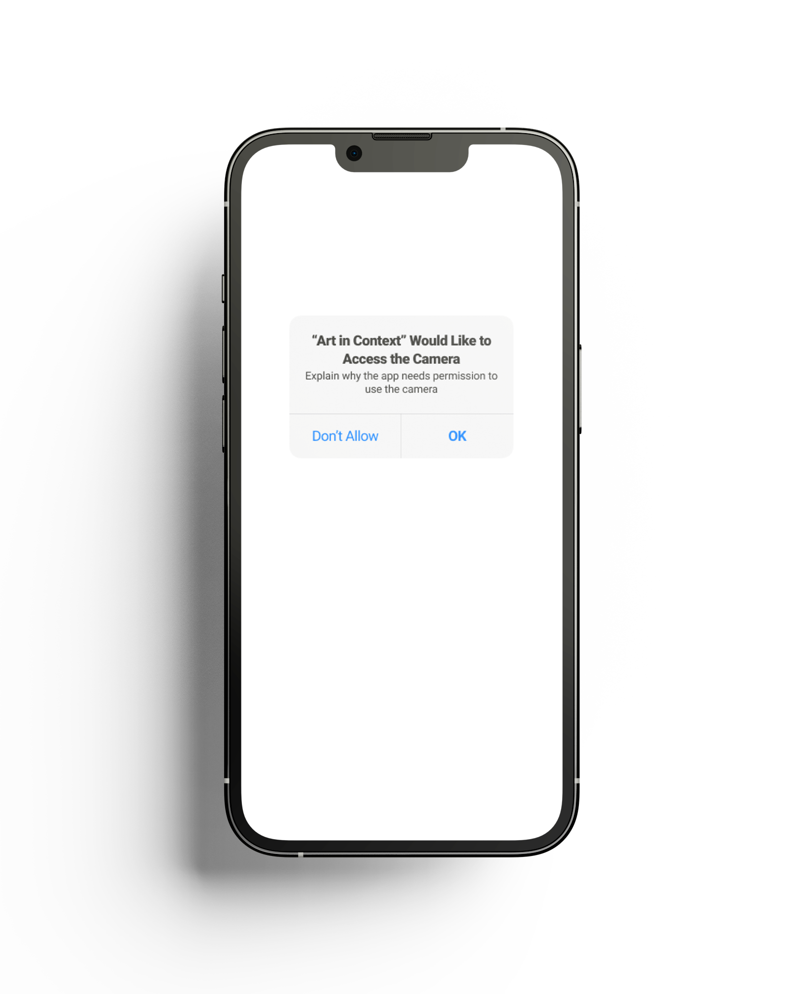
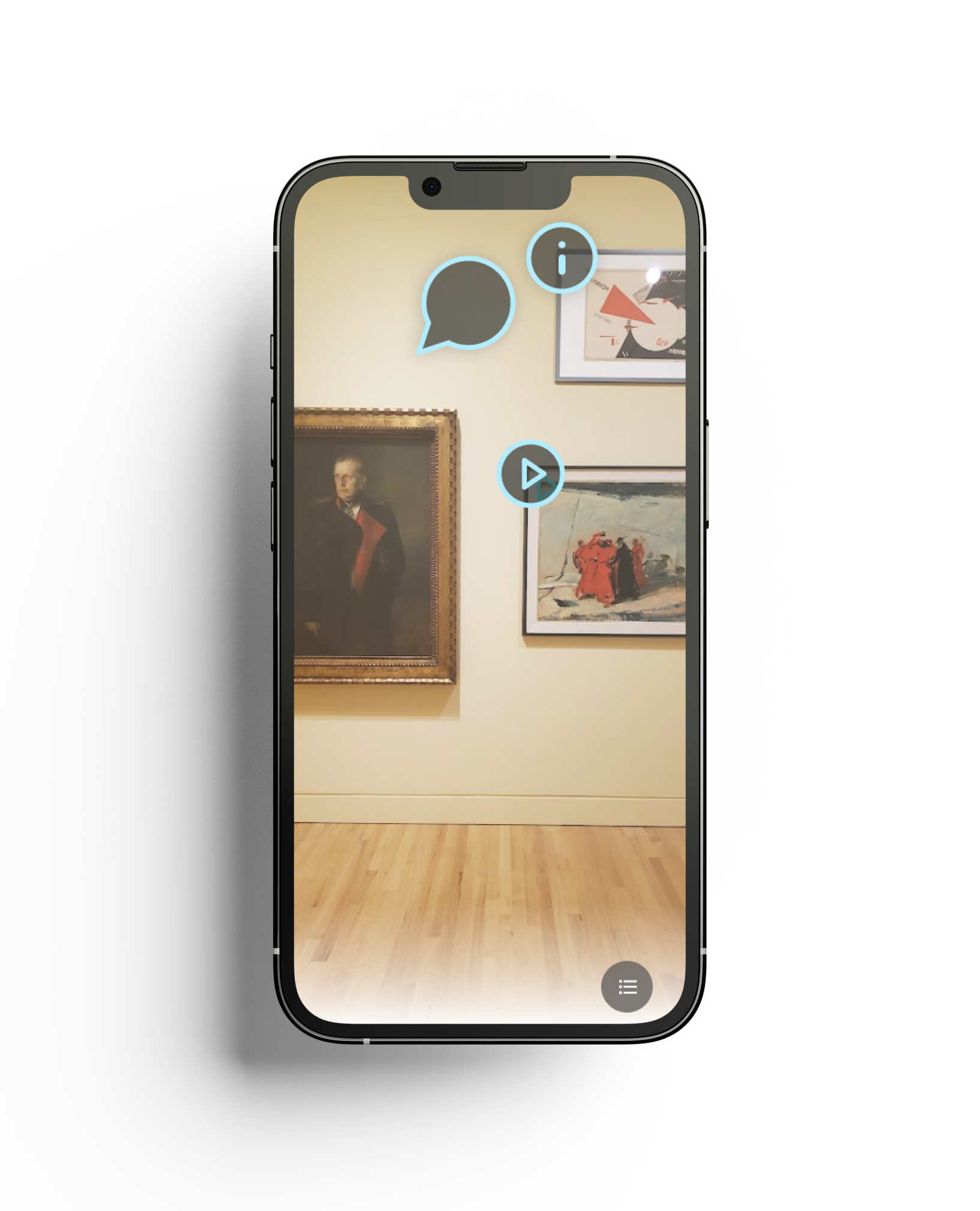
After giving permission to use the users' camera, Icons for the main features hover at the corner of each painting. Tap any of the virtual icons to see more.
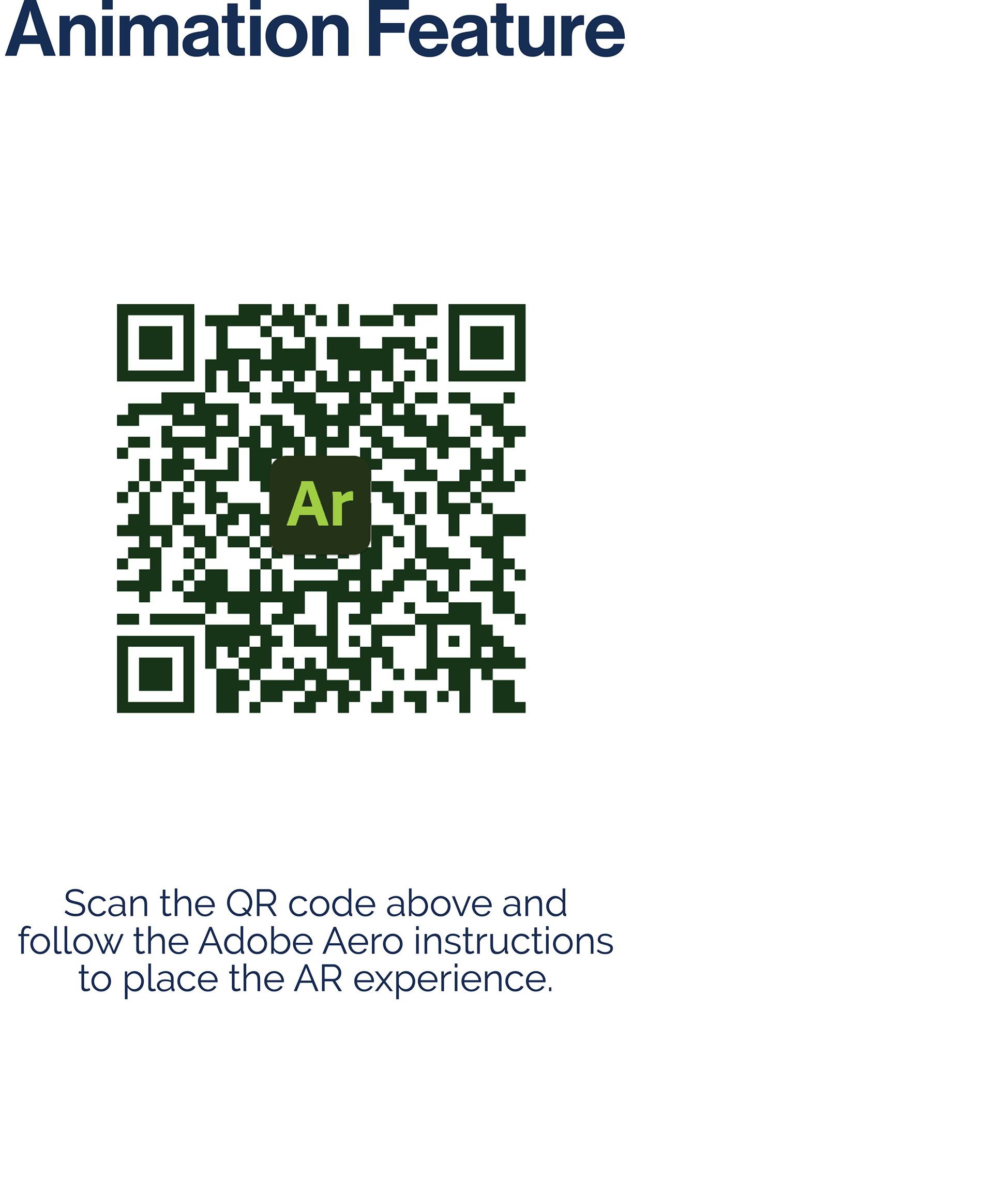
Try it Yourself!
Adobe Aero is in Beta and currently only available on Apple
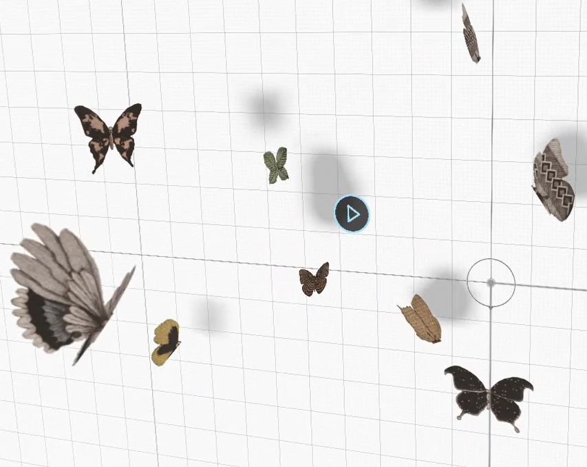
Animations made from elements of the artwork surround the viewer.
Users can view additional educational material about Gabriel Von Max's 1881 painting "Selfenblasen (Soap Bubbles)"

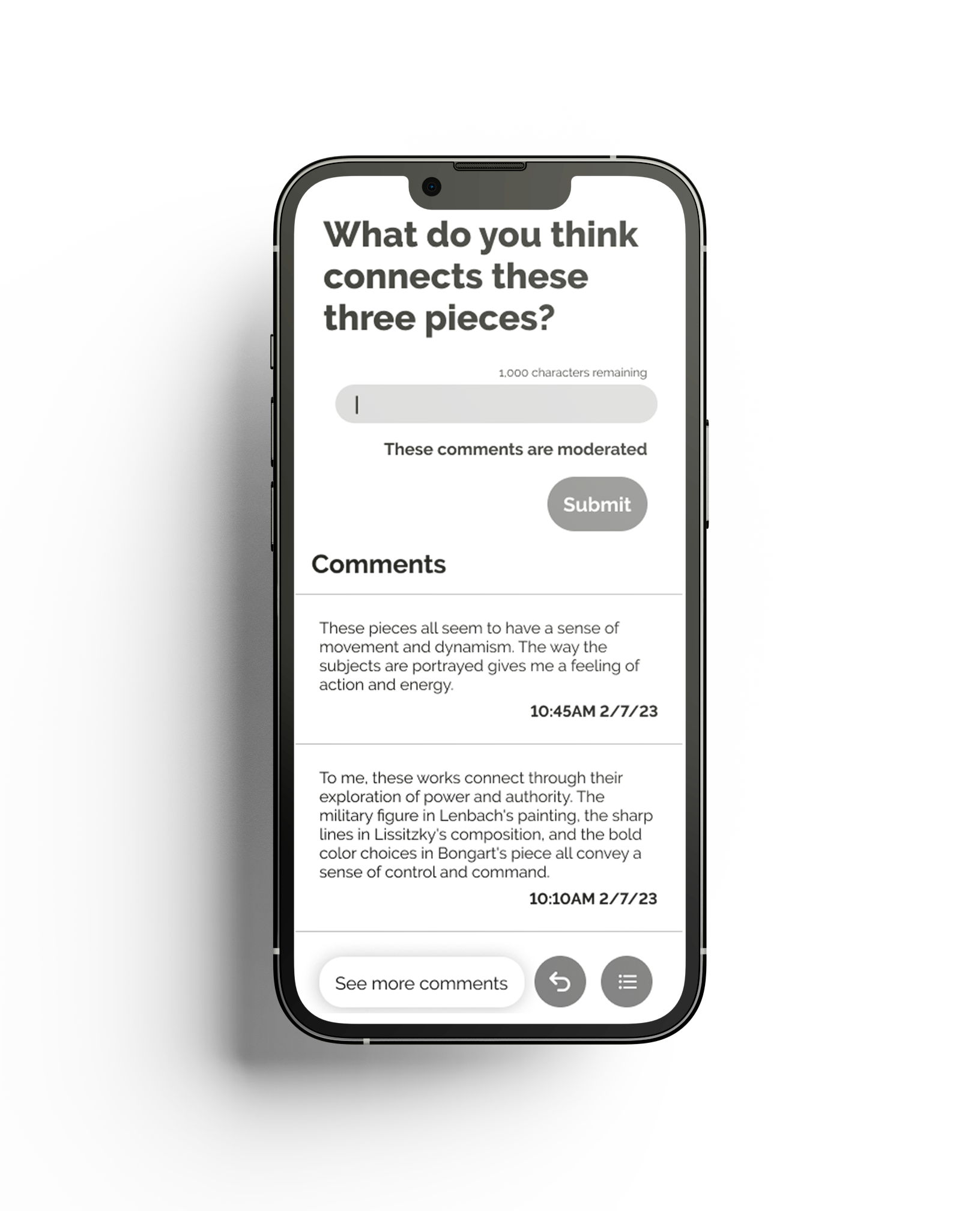
Comment Feature:
Users are prompted to answer questions about the artwork to create a dialog among visitors.
I used Chat GPT to generate sample visitor comments for the prototype. Chat GPT was able to generate comments from a variety of visitors, from those who have a lot of knowledge of art history, to those less informed.
I used Chat GPT to generate sample visitor comments for the prototype. Chat GPT was able to generate comments from a variety of visitors, from those who have a lot of knowledge of art history, to those less informed.
Designing for AR
The goal of Augmented Reality is to blend the virtual and real space, and the design needs to assist that goal. Here are several considerations to keep in mind for this app:
Users should not need to step back to fully view the AR experience, or they might bump into other visitors or the artwork. Markers on the ground to indicate where users should stand can help with this issue.
Users should not need to step back to fully view the AR experience, or they might bump into other visitors or the artwork. Markers on the ground to indicate where users should stand can help with this issue.
The UI should be very simple so users are not distracted from the experience. The UI must also stand out clearly against any background. A drop shadow can ensure the UI stands out against a bright background.
Holding a phone or Ipad up for long periods is tiring for users, so each experience short should be kept short.
The design system must match the quiet and clean museum aesthetic. A pop of pale blue was added to draw attention to important features.
Prototyping in Adobe Aero
I had the chance to experiment with new design tools for this project, such as Adobe Aero for AR prototyping and Chat GPT for generating sample comments for the social feature.
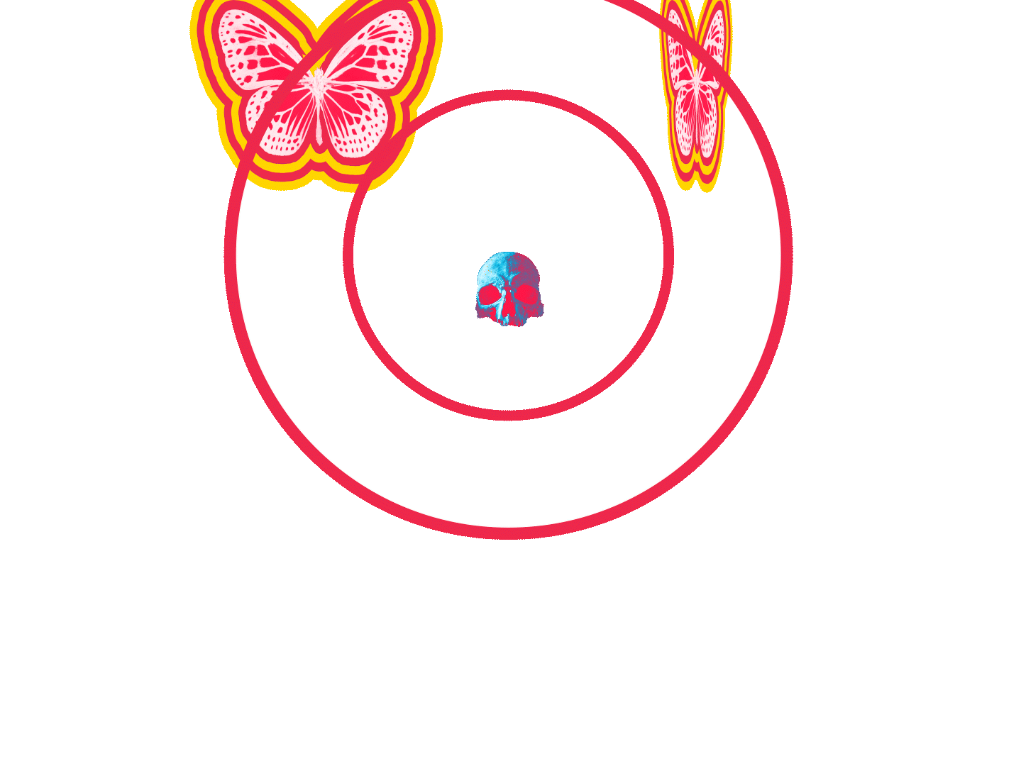
As Adobe Aero was still in beta during the project's development, I encountered several limitations that required me to find workarounds. For example, it was exciting to build butterfly wings that moved in 3d, but the workflow in Aero made that very time intensive. I eventually opted to animate them as flat images in After Effects instead.
Chat GPT proved to be effective at generating a wide variety of comments from simulated visitors with varying opinions. I would use this tool again in the prototyping stage of development.
User Testing
It's important to consider that the user is only able to view the AR experience through the limited frame of their phone screen, which can lead to users missing out on important elements. To improve the user experience, animated arrows guide users and prompt them to explore further within the virtual space.
Through further testing, I discovered that the AR artworks were too small, leading to difficulty in viewing them clearly. I leveraged one of the key benefits of AR and increased the size of the paintings to be larger than life, resulting in a more engaging and memorable user experience.
Through further testing, I discovered that the AR artworks were too small, leading to difficulty in viewing them clearly. I leveraged one of the key benefits of AR and increased the size of the paintings to be larger than life, resulting in a more engaging and memorable user experience.
Final Insights:
As a student, most of my previous UX/UI projects were collaborative efforts with other team members. This project presented me with the opportunity to independently tackle every aspect of the design process, from research, wireframing, and user testing, to the final design.
Next Steps:
Design additional crucial features such as accessibility options, navigation, and the tutorial.
Create more AR animations to pair with other art pieces for visitors to interact with.